Looking Good Hotel
Brand Identity
1. Brand Overview
Looking Good Surf & Beach Hotel approached us with the goal of modernizing their identity while staying true to the authentic surf culture that defines El Zonte, El Salvador.
As a boutique surf hotel founded by three surfer friends, the brand needed an identity capable of expressing:
• The local surf lifestyle
• A sense of community and friendliness
• Adventure and movement
• The natural beauty of El Zonte’s waves
• A modern and welcoming personality
Their goal:
Create a cohesive identity that feels fresh, energetic, and authentic — adaptable across signage, digital platforms, merchandise, and guest experiences, while reflecting the relaxed, adventurous spirit of a surf-destination hotel
2. Concept & Exploration
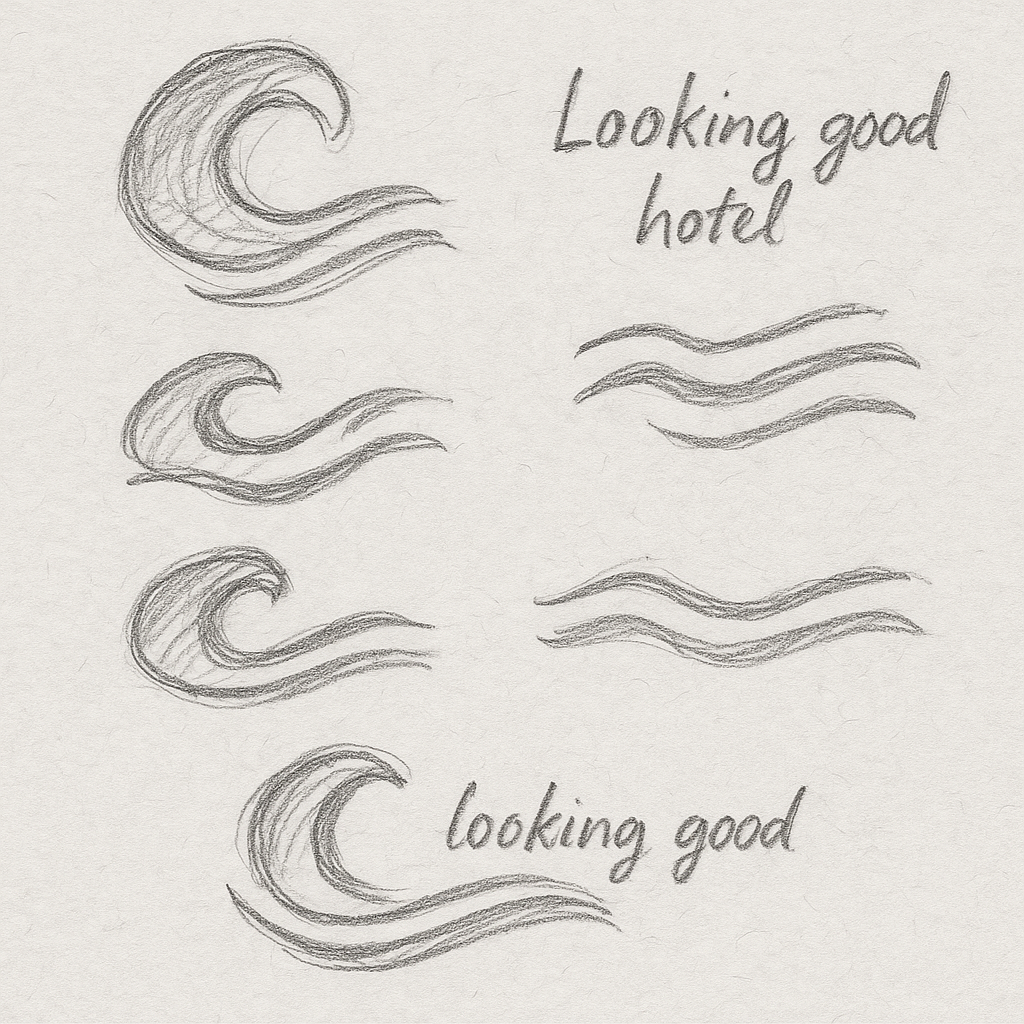
Our exploration began with quick hand-drawn sketches inspired by:
• Ocean waves
• Surfboard lines
• The natural flow of El Zonte’s coastline
The goal was to capture a simple, fluid symbol that expressed movement, surf rhythm, and coastal energy.
Early sketches explored:
• Wave crests
• Layered flowing lines
• Organic curves
This phase defined a clean, modern, unmistakably coastal direction.
3. Logo Development
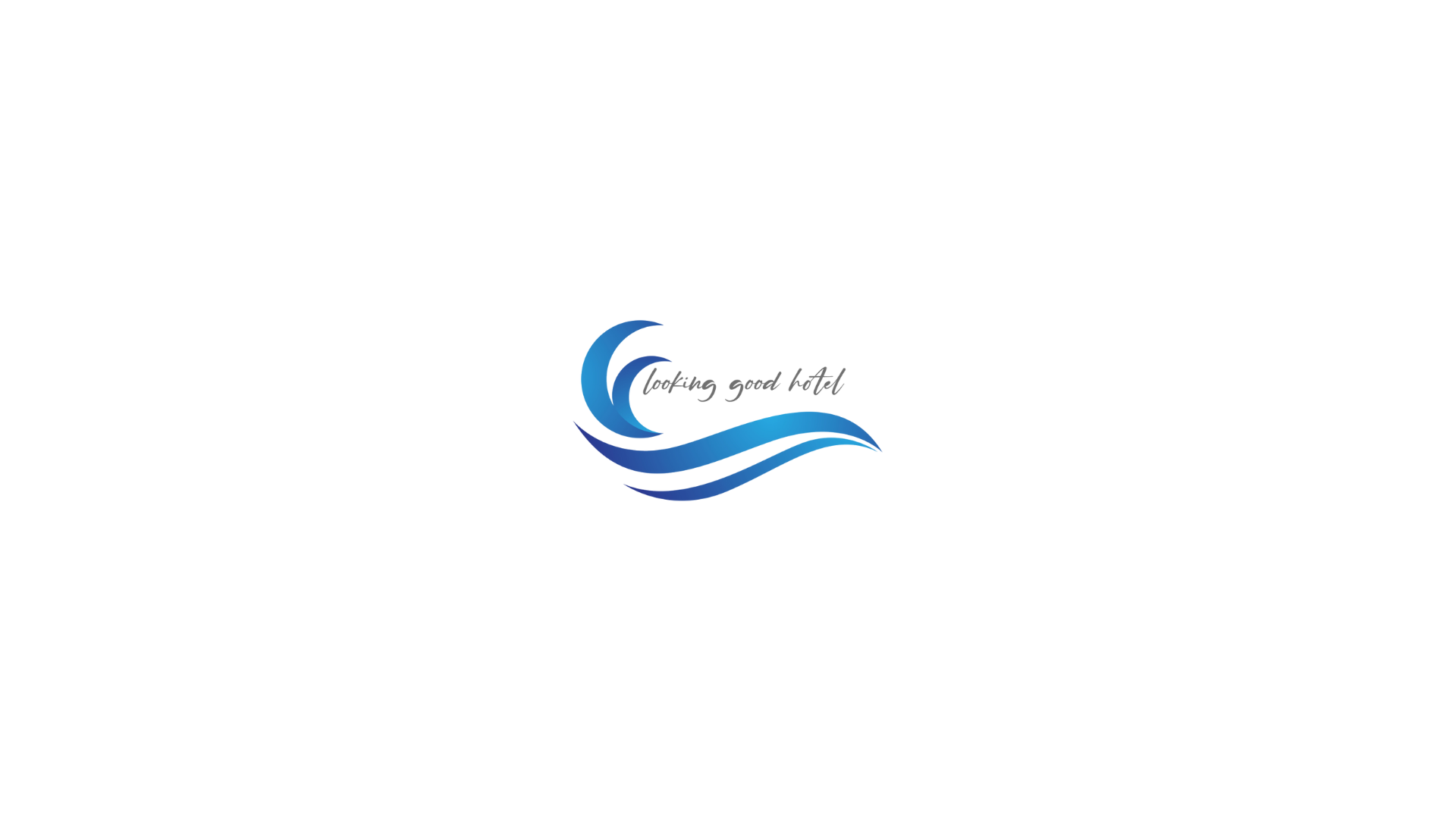
The final logo combines three essential elements:
• A triple-wave form — expressing movement and coastal flow
• A cresting wave — symbolizing energy and surf culture
• A handwritten logotype — adding a relaxed, personal touch
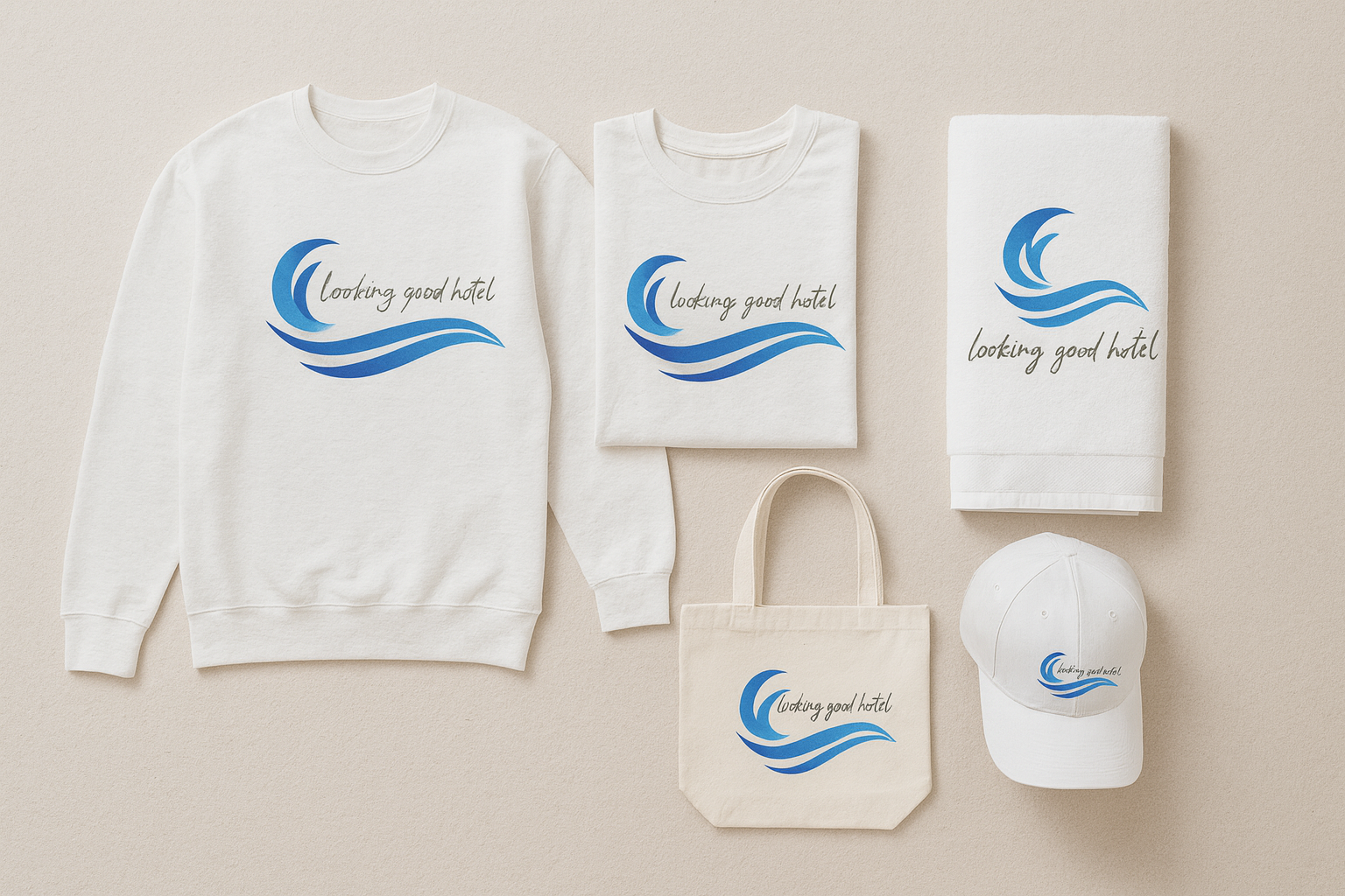
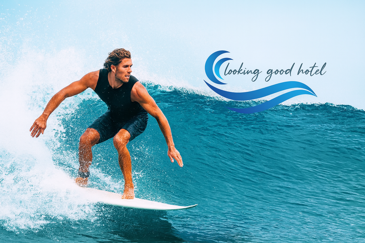
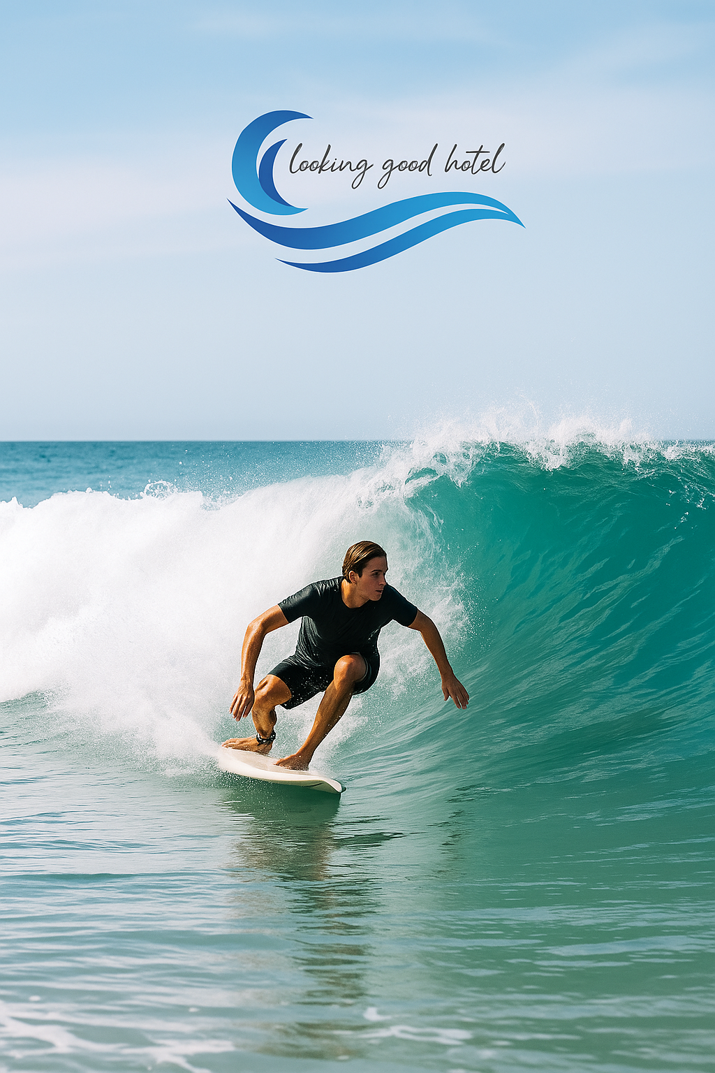
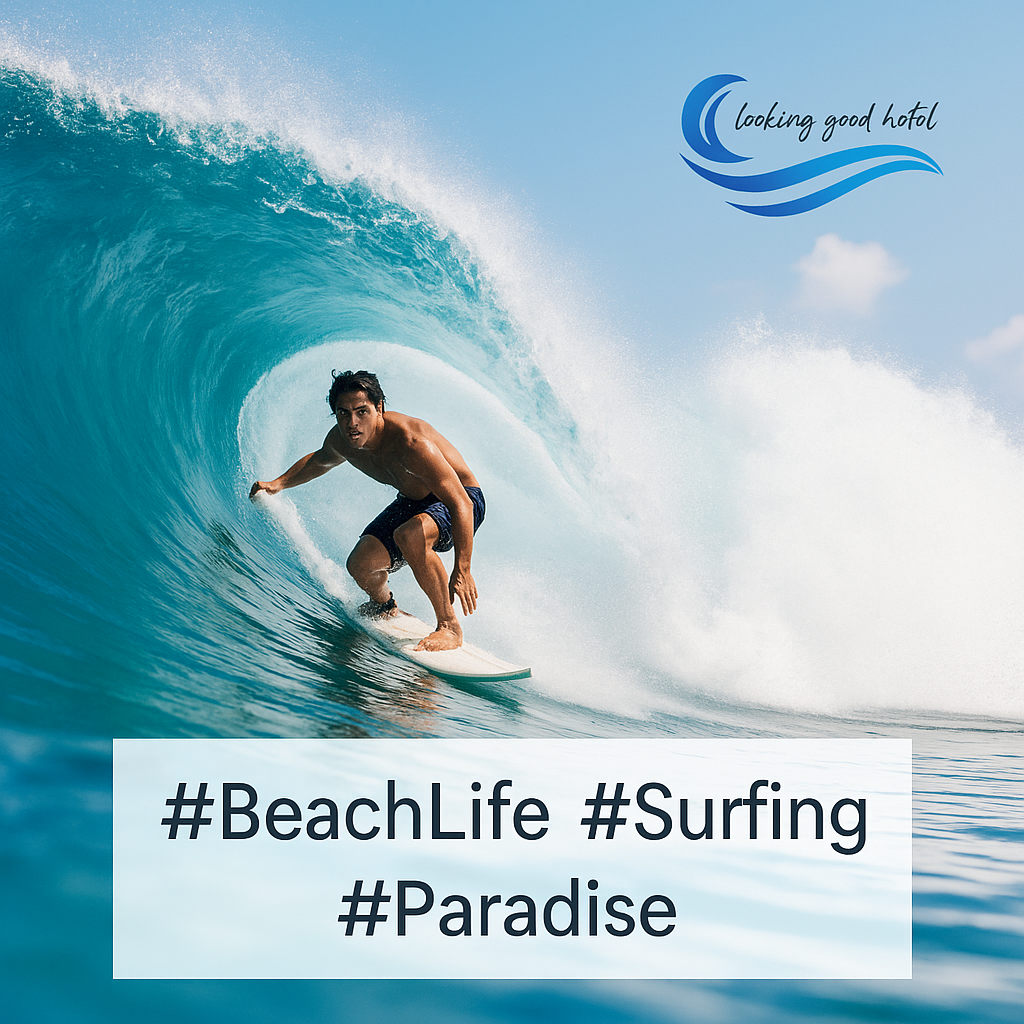
The result is a fresh, modern, and versatile mark that works across merchandise, signage, and digital platforms — and is instantly tied to the surf-lifestyle identity.
4. Color Palette
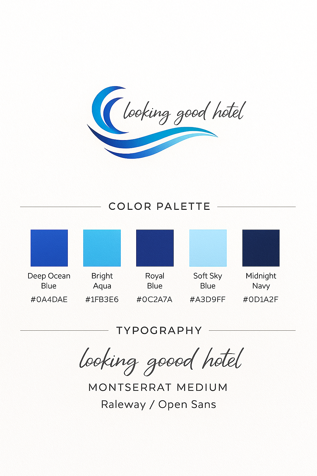
The palette draws from ocean tones, surf culture, and El Zonte’s natural environment:
✓ Deep Wave Blue (#003F87) — strength & ocean depth
✓ Surf Cyan (#22A7F0) — freshness & movement
✓ White Foam (#FFFFFF) — clarity & balance
✓ Sand Gray (#D9D9D9) — soft, neutral grounding
Together, these colors create a clean, modern, and coastal identity.
5. Typography
Typography reinforces the relaxed but modern personality of the brand:
✓ Primary Font — Script Handwritten
Adds warmth, human touch, and a friendly surf vibe.
✓ Secondary Font — Clean Sans-Serif (Raleway / Montserrat)
Provides clarity, structure, and strong readability.
The combination delivers a balanced, contemporary typographic voice
6. Result
The Looking Good Hotel rebrand delivers:
✓ A fresh, modern identity rooted in surf culture
✓ Clear differentiation from nearby hotels
✓ A cohesive visual system across all touchpoints
✓ Stronger guest perception of authenticity and quality
✓ A brand that reflects the true spirit of El Zonte
The final identity positions Looking Good Hotel as a community-driven, adventure-focused boutique surf hotel — capturing the Pacific spirit in every detail.
