ITA AIRWAYS
Brand Identity · Visual System
1. Brand Overview
ITA Airways approached us seeking a revitalized brand identity that would modernize the airline while honoring Italy’s rich cultural legacy.
The goal was to build a visual identity capable of expressing:
- National pride
- Movement and dynamism
- Freshness and optimism
- A modern, global presence
They needed a system that would work seamlessly across aircraft livery, uniforms, signage, digital channels, and promotional materials — all while reinforcing the message:
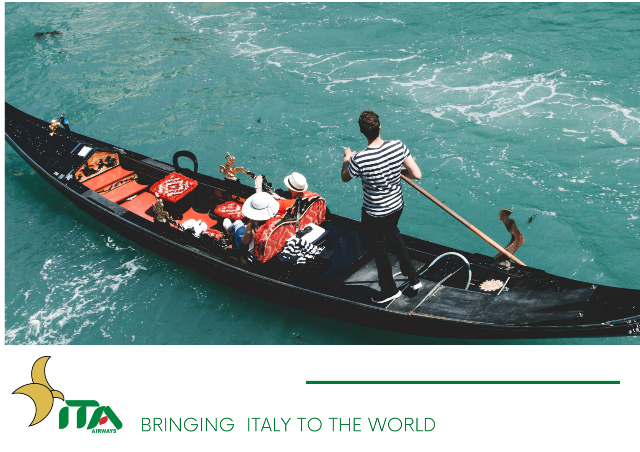
“Bringing Italy to the world.”
2. Concept & Exploration
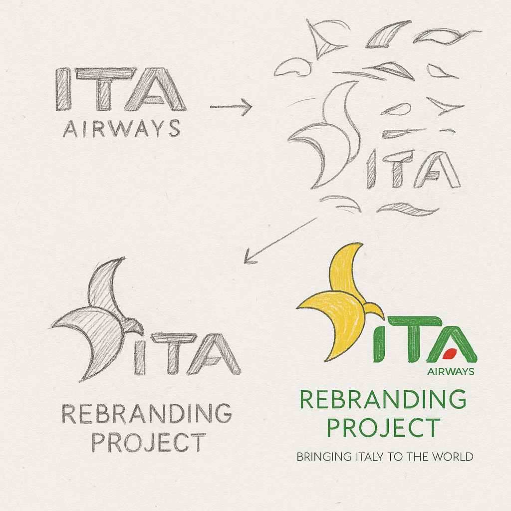
We began the creative process by exploring visual inspiration from Italian aviation history, national colors, aerodynamic forms, and organic curves.
Early sketches aimed to create a fluid, modern symbol that expressed movement, elegance, and Italian identity.
- Stylized wing shapes
- Curved aerodynamic lines
- Modernized “ITA” letter forms
- Motion-driven silhouettes
This phase became the foundation for a fresh, dynamic identity.
3. Logo Development
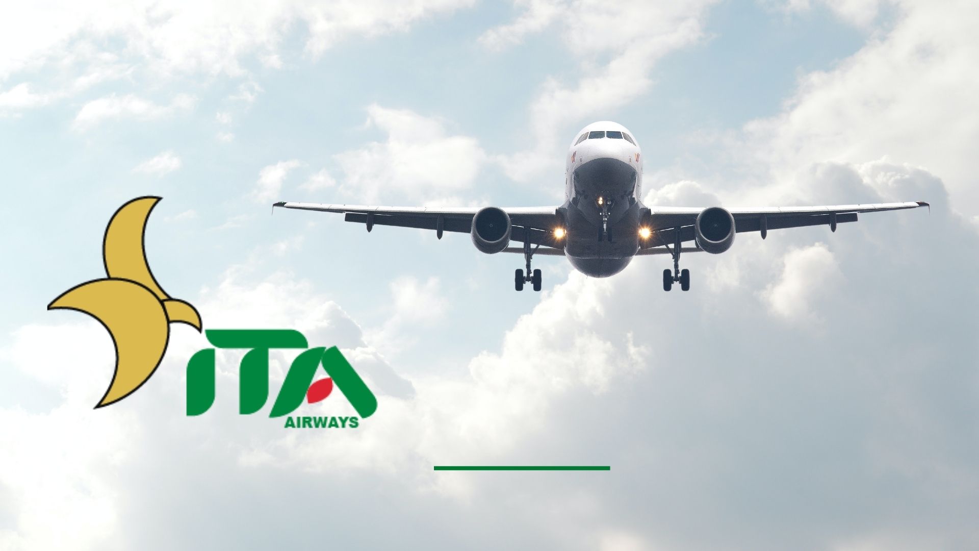
We refined multiple concepts until the symbol evolved into a modern, distinctive mark inspired by:
Aerodynamic motion and fluid takeoff forms
Subtle integration of Italian national colors
Clean, geometric “ITA” letter construction
Warmth and optimism expressed through the golden abstract wing
This exploration resulted in a logo that is:
Instantly recognizable
Optimistic and energetic
Strong across both large aircraft livery and small digital formats
Versatile for uniforms, signage, and merchandising
4. Color Palette
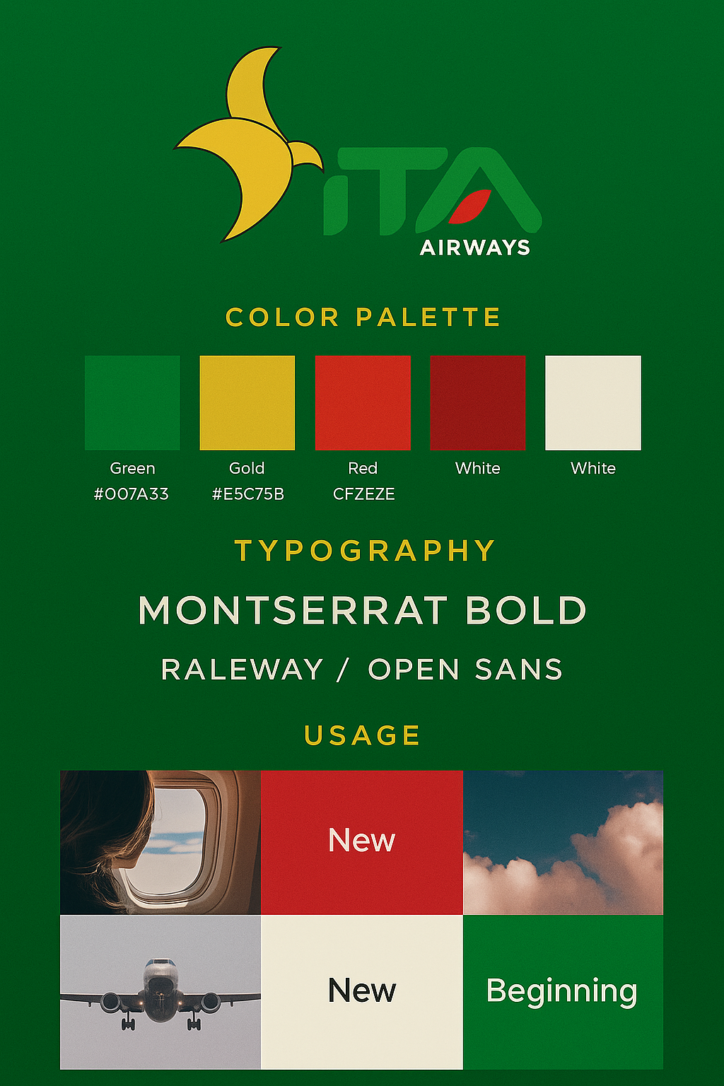
The visual identity is built on a vibrant, modern reinterpretation of Italy’s national tones:
Green (#007A33) — fresh, modern, and forward-looking
Gold (#E5C75B) — warmth, hospitality, and Italian elegance
Red (#CF2E2E) — passion and national identity
White (#F7F7F7) — balance and clarity
Together, these colors create a bold, memorable, and globally recognizable palette.
5. Typography
To reinforce modernity and clarity, we selected a combination of contemporary sans-serif typefaces:
Montserrat Bold — strong, clean, and highly legible
Raleway / Open Sans — versatile secondary typefaces for digital and print applications
The type choices communicate:
Confidence
Modernity
Professionalism
Their geometric precision complements the aerodynamic logo, creating a unified brand voice across all touchpoints
6. Applications
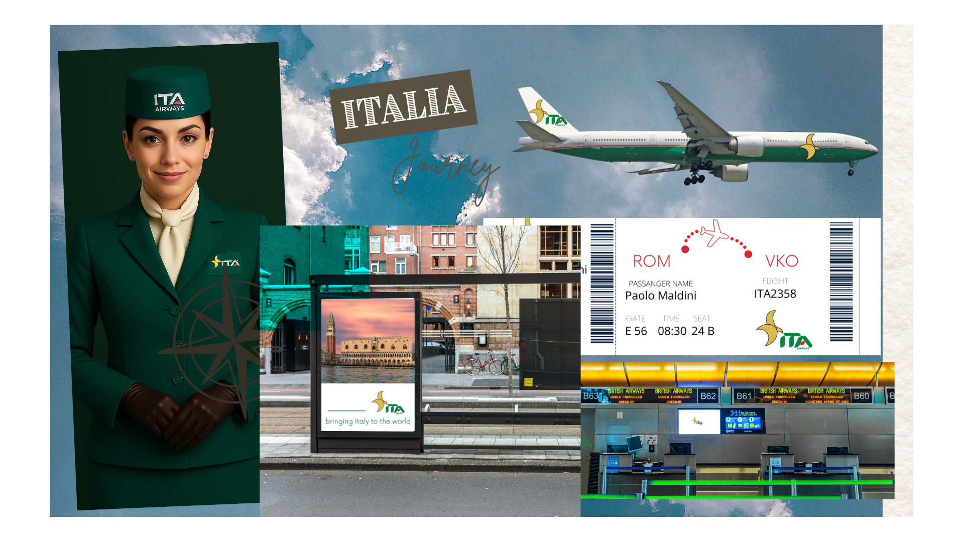
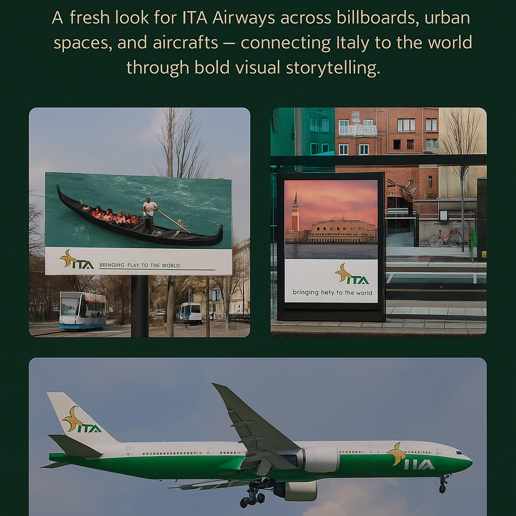
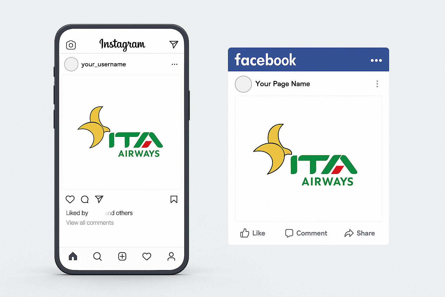
The new ITA identity extends seamlessly across all brand touchpoints, including:
• Aircraft livery, with bold graphics that highlight motion and national pride
• Crew uniforms, reflecting modern Italian elegance
• Airport signage, ensuring clarity and consistency
• Travel documents, with clean, structured layouts
• Digital platforms, including social media and online ads
• Urban advertising, connecting the brand to global travelers
7. Result
The ITA Airways rebrand delivers:
• A bold, modern identity
• Strong national symbolism
• Clear, cohesive communication
• A unified visual voice across aircraft and digital platforms
• A refreshed perception of ITA as a world-class airline
The new identity confidently expresses Italy’s spirit — bringing Italy to the world through color, elegance, and motion.
